
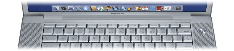
A couple of recent posts to other blogs have hit on something that has bugged me about Mac OS X since the "birth" of the "Metal" theme. In the OS 9 days, there used to be this thing called the Apple User Interface Guidelines. In it Apple specified exactly how things were supposed to look and feel. I even remember rumors of a "User Interface Police" that would take you to task if you strayed. (This may or may not be true.) Back then, there was pretty much one theme to worry about, and the guidelines were pretty much set in stone. Fast forward to today. With the advent of both Aqua and Metal, developers now have two themes to contend with. Not only that, there seem to be two differing window "styles" that exist as well. One style has user interface elements that run to the window edges. Think Mail, and XCode (if you're a developer). The other style has user interface elements that don't run to the edges. Think iTunes, iChat, etc. At first blush, you'd look at these two sets of applications and determine that "Aqua apps run to the window edges, and Metal apps have borders." But herein lies one of the many inconsistencies. While this is true in general, Apple's Safari (Metal) throws this paradigm out the window and runs its elements to the window edges. DiskUtility however uses the default Aqua theme and has borders.
The latest Human Interface Guidelines has no specifics on what's right and what's wrong. Personally, I don't like the "run to the edges" look, and don't use it in MacGourmet, or SQLGrinder 2. Others clearly feel the same way, as seen in Panic's
Transmit and
Candybar, and in Ranchero's
NetNewsWire. Brent Simmons even wrote about this in a recent post to his
weblog:
"For a long time during earlier NetNewsWire beta testing, the margins were indeed collapsed as shown. Some people thought that the layout was cramped this way. So we tried it for a while and then went back to having margins.
And yet... some people preferred the no-margins look. Its cleaner, you might argue, and it means you have more available horizontal space. Look at Mail, for instanceno margins. (And look at MarsEdit: same layout as Mail.)
And yet, again... if you look at iTunes, iCal and other Apple apps, they have margins. Sure, theyre metal, and thats a difference, but still it shows that there isnt a hard rule about margins that applies everywhere."
What's right? What's wrong? Who knows. It's essentially up to us as developers to decide. The end result is not based on a set of guidelines published by the source of the user interface (Apple) but on personal preference. Hardly a recipe for consistency, eh?
Additionally, Apple isn't clear as to what theme should even be used. Their guidelines state:
You can use a brushed metal window if your application:
- Provides an interface for a digital peripheral, such as a camera, or an interface for managing data shared with digital peripheralsiPhoto or iSync, for example
- Strives to re-create a familiar physical deviceCalculator or DVD Player, for example
- Provides a source list to navigate informationfor example, iTunes or the Finder
Dont use the brushed metal look indiscriminately. Although it works well for some types of applications, some applications appear too heavy when using this look."
Not exactly specific are they? Look at Apple's own suite of apps: They seem to follow the above, but what about Safari? How does this fit their own guidelines? I'd argue they don't. And notice they say "You can" instead of "you must" or even "you should." Following the above, MacGourmet could be metal. So could NewNewsWire, but clearly both Brent and I decided that Metal didn't work well for these apps. Safari really screws with developer's heads in that it's Metal, and doesn't fit ANY of the described uses above. Even worse, it's a Metal app with no metal borders. Confused? You should be. Apple says "Don't use the brushed metal look indiscriminately" and then it seems they do exactly that by making Safari Metal.
And now as if this all wasn't confusing enough, Apple may be adding yet ANOTHER theme to the mix, if rumor sites and John Gruber of
Daring Fireball are to be believed:
"Apples fourth theme is something slated to arrive with 10.4. Its not a secret: you can see it in the screenshots Apple has posted for Spotlight and the updated version of System Prefs. Unlike brushed metal or the Pro theme, however, this new look is so subtle you may not even notice it.
Its mostly like Aqua, but with certain touches borrowed from brushed metal; particularly the way that window title bars and the toolbar area underneath are combined as a single expanse. And, mercifully, its free of pinstripes. In the same way that brushed metal matches the look of PowerBook and PowerMac hardware, this new theme is perhaps intended to evoke the look of iBook and iMac hardware."
Yow, that's all we need. How is it that the bastion of consistency for so many years, has suddenly become so inconsistent? Is someone asleep a the wheel? I won't even go into the additional "themes" and look and feels of GarageBand (a darker grey metal and wood), and the almost "XP-ish" look of some of the elements in Tiger as seen in
Automator and
Spotlight. Seems like anything goes these days.
Please Apple, I IMPLORE you, be clear on these things for us. All Mac apps should look and feel the same way. What themes should be used for one kind of app or another should not be left up to the personal preference of developers. Have you used Linux lately, or Windows? That's what Mac OS X could become. If you don't even seem to adhere to your own Human Interface Guidelines, what are we as developers supposed to do? Please make these things clear. Put them in stone with some "Thou Shalts" and "Thou Shalt Nots." It's only by doing this that you will prevent the problems we are already seeing, even from your own applications.
 The Boston Red Sox are World Series champions. I'm still stunned. After the greatest comeback in the history of baseball, the Red Sox didn't drop a single game to the St. Louis Cardinals on the way to their first World Series Championship since 1918, a period of 86 years. How sweet it is. When I think of all the generations that have passed without being able to see a single championship in Boston, and who have witnessed so many catastrophic game 7 (and game 6) collapses, it makes me, as a lifetime baseball fan appreciate this win that much more. I've considered myself one of a nation of long suffering Red Sox fans. What are we to do now, now that the Red Sox have finally given us what we've wanted all these years? CELEBRATE! I think tonight, Bill Buckner sleeps a little more soundly...


