On Software Design: The New Inconsistencies of OS X. Or, How Mac OS X Can Become Windows
 Wow, Brent Simmons over at Inessential.com has been blogging up a storm lately (maybe now that NNW 2 is out he has the time), pointing out numerous interface inconsistencies in our beloved OS. I've blogged about this before, and with the release of Tiger, the inconsistencies have only gotten worse.
 In a comment on Brent's writings, Dan Wood over at Karelia mentions something we and I'm sure many other Mac developers only know too well:
For instance, in our upcoming application, we are using a custom Split-view class (RBSplitView for the developers reading this) so we can have a cleaner, no-border look found in Tiger's otherwise ugly Mail application. We had to make some adjustments to the standard text input widget to make it look modern. We had to hand-roll our own subtle gradient backgrounds (which seem to be replacing stripes more and more, as Brent points out). We've had to make graphical buttons instead of using Apple's standard text buttons.
All this, just to get an application that looks like it belongs on Tiger rather than, say, Jaguar.
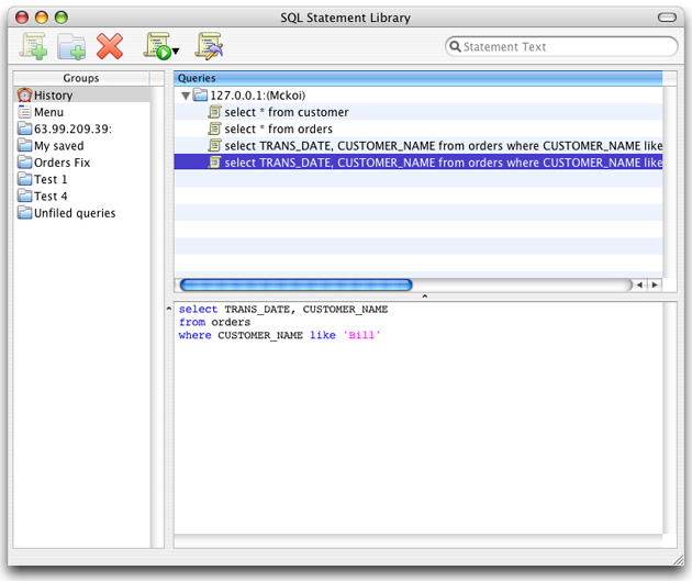
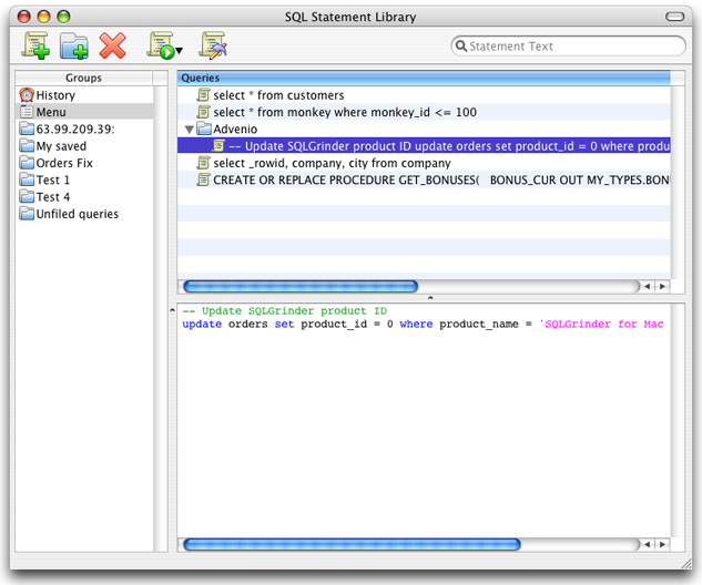
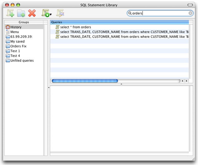
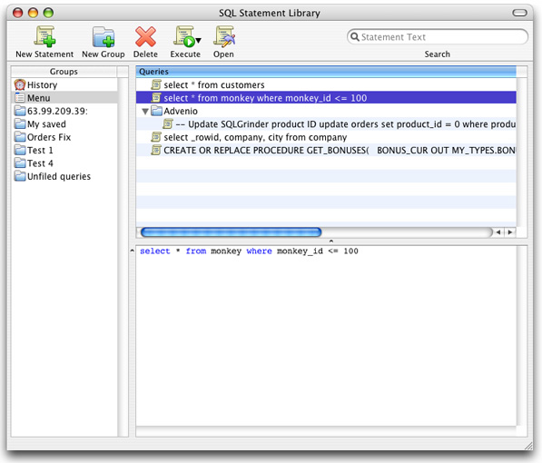
While working on SQLGrinder 2 there was a point where I was essentially forced to roll my own versions of striped table rows and the toolbar search field. The versions of Apple apps at the time had "standardized" on these things as options for their users, and there was a certain pressure to add them to your apps to keep up. Sure, Apple eventually added these options as part of the toolkit we have available to us as developers, but it took them awhile. I spent the time to implement these things, only to then rip out my own implementations, which were pretty close to but not exactly like Apple's versions of these things, and then use the new offerings from Apple. Big waste of work, due to the lag time.
I seems that every new release of OS X brings more and more of these new design elements. I'm not saying it's not good to keep improving the user interface by adding new features to the developer toolbox, the problem I have is that a lot of these new things tend to be more cosmetic than functional: the new Mail toolbar buttons, the new Mail splitter, the new gradient table row shading, tabs like the ones in safari. Sure there are "lesser" elements available to us as developers, but they often don't have the "bling" that users come to expect. And as Brent pointed out, sometimes even when they DO give us the user interface elements to use, they don't work EXACTLY like the elements in their own apps!
From The inexplicable pressed state of the round textured button:
Everyones familiar with Safaris cool buttons, right?
Here, for example is the home buttonfirst in normal and then in pressed state. Note how it highlights in blue. (Why it doesnt highlight in graphite if youre using graphite I wont try to explain, because I cant.)
So after dragging the button to a window in Interface Builder, I ran the window to see the button in action. I clicked on it. It looked like this when pressed:
Looks good, right? A nice pressed look.
But see the problem? Its not blue.
Its not blue, so you cant use it
Heres what would happen were you to release an app that uses this button. Users would report it as a bug that the button doesnt turn blue. Theyd point to some of the many different apps that use this same button, and say, See? The standard on OS X for these buttons is that theyre blue when pressed! The users would be absolutely right.
So then you have to go back to the custom method of making images for each of the states and perhaps writing a little code to get the behavior right. Not hard, but youll have to do it.
But now youll wonder why you have to do it, when this button exists as a standard button type in Interface Builder.
Where oh where are the consistency police? I've said it before, it seems to me that Apple now seems to have internal user interface and application teams that don't talk to each other at all. In fact it almost seems like they go out of their ways NOT to talk to each other and to come up with new and different ways of building Mac user interfaces, constantly changing things for the sake of change.
So what's the Windows connection here? Well Windows has always been plagued by a "roll your own UI" kind of mentality. There has never been a clear vision in user interface design on that platform, and you see a lot of "custom" user interfaces that are very non-standard and "outside of the box." More and more Apple apps are striking me as being like that. Brent also has a similar view:
Heres the thing to remember: developers look to Apple for guidance. If Apples UI decisions say that its okay to sacrifice usability for a distinctive look, then many developers will do that. Its a long, long way awaybut at the end of that particular road is Windows.
Mail has a completely different UI from anything in the OS or in previous Apple applications. I will say that in general, it still has the same "feel" as your typical Mac app, but the "look" is completely different. Until Brent pointed it out, I didn't even realize that there was now a new splitter "grab bar" at the bottom of the window. Hm, seems to me that if you need that, that there might be a problem with your splitters...
From Splitters gone wild:
I can easily explain this from a coolness factorbut I cant explain it from a usability standpoint, because its very difficult to grab such a narrow target. (And it doesnt resemble a splitter bar at all, so you dont necessarily realize that you can grab it.) To make up for it, theyve added a little grab thing at the bottom of the window which is easy to grab. (Which I also, no kidding, really like.)
Heres the thingthis isnt the only non-metal app to completely avoid standard splitter bars.
Look at Keynote, for instance. No splitter bar at all, just a grabber at the bottom. But, though similar, its different from Mailin Keynote you cant grab the splitter bar at all, you have to use the grabber at the bottom.
And then theres Xcodealso non-metal, and with yet another custom splitter bar.
I've done a lot of user interface study over the years, and being consistent is such an important aspect of design. It's way more important than making something "pretty" or "clever." Let me put it this way: When I come across the Mail in Tiger for the first time, even with the new look and feel, I can quickly adapt to the design, mostly because of my overall past use of different UIs. Now take my mother for instance. Switch her from Panther Mail to Tiger Mail and the transition will not be nearly as smooth. Less experienced users just can't adapt to even subtle changes from one application to another. For them, sometimes moving from one Apple app to another can cause them to feel like they have to learn a whole new way of interacting with "the computer." This isn't the way things used to be, and this isn't a good current or future direction of OS X design, as it only serves to further confuse less experienced users. From one app to another, a splitter isn't the same splitter, the smart folders "builder" isn't the same, a button isn't the same button, etc.
For more of Brent's recent insightful (or is it inciteful) writings:
![]() Digg This |
Digg This | ![]() Post to del.icio.us
Post to del.icio.us
posted by Michael on Sunday, May 29, 2005
|
0 comments
![]()
.jpg)