On Software Design: The Under-appreciated Art of User Interface Design
 It often occurs to me that user interface design is an under-appreciated art. Yes, there is a definite art to the design of a good, solid, intuitive, elegant user interface. Not every one can do it, just like not everyone is a great painter or photographer. Oh, someone may know how to use a camera, and they may know how to put brush to canvas, but neither of those abilities makes them a great photographer or a great painter. I think that in general, people realize and recognize this. Why is it then, that there is this belief prevalent in companies big and small everywhere, that anyone who can write code and develop software can design a good user interface?
I think the belief comes partially from the lack of exposure to really great user interfaces. People have to deal with bad user interfaces in life every day, all round them. While there are some very usable and very well done applications for Microsoft Windows, there are far more that are just terrible. I know, I've used a lot of them. But I'm good at recognizing what's good and what's bad. I've been trained to know the difference. I've had years of study, and years of design experience. Even with all this, I still don't get it right every time, especially if I'm also writing the code for the software.
Intuitive - known or perceived by intuition, which is the power or faculty of attaining to direct knowledge or cognition without evident rational thought and inference.
Elegant - of a high grade or quality, tasteful richness of design or ornamentation, scientific precision, neatness, and simplicity.
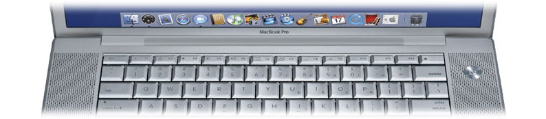
I've seen these terms bandied about for really poor, badly designed user interfaces in forums on the web and in discussions with users, more often than I care to count. This leads me to believe that people either don't know the definitions of these words, or they have really, really low standards. A user interface that is intuitive is one that has functionality that just sort of "falls" where it should. It's an application that feels like it fits on the platform that it is being run on. What might be intuitive on one platform is not necessarily intuitive on another. Take many Java applications for instance. I've been a Java programmer for many, many years. I've been a strong proponent of the language. It's great for so many things. One thing Java is still is not good at is being used for a write once, run everywhere user interface. In general, most of these applications that were written on Windows, Linux, or even the Mac, and designed to run everywhere, do poorly everywhere, unless the design is tied to at least one platform, in which case they work well on one platform and badly on the rest. Jack of all trades, master of none, seems to be a phrase that fits. I've seen SO many well written and functional Java apps that work on OS X but are really terrible OS X applications. They don't fit the platform. Things aren't where you expect them. They use different design paradigms than are usual for OS X. All this leads to an often frustrating and confusing user experience. Apple's "Introduction to Apple Software Design Guidelines" states: "An easy-to-use program offers a compelling, intuitive experience for the user. It offers elegant solutions to complex problems and has a well thought out interface that uses familiar paradigms. It is easy to install and configure because it makes intelligent choices for the user, but it also gives the user the option to override those choices when needed. It presents the user with tools that are relevant in the current context, eliminating or disabling irrelevant tools. It also warns the user against performing dangerous actions and provides ways to undo those actions if taken." THIS is what describes a great application. Many, many applications don't even come close to being able to be described this way.
I'm not claiming that usability and user interface design is easy, it's not, it's very difficult. I certainly don't always get it right. Even Apple doesn't always get it right. There are STILL some aspects of OS X that don't seem right to me (The font panel for instance). But I do know what to look for, I do know how to get information from users that helps me improve things. Design-centric companies like Apple do too. Unfortunately most companies are NOT like this. They seem to think design is secondary, even when it rises up and bites them on the ass at the end of a development cycle. They don't hire the right people to do the design for them. If they did, I might get a lot more work. Even when they DO hire experts, they often don't listen to them for "business" reasons.
Examples of bad design abound. BMW's iDrive is much maligned for taking some of the the simple operations of a car: heating, cooling, etc., and burying them under a cascade of confusing and hard to use menus. The best user interface is the simplest, every time. Not the most pretty, or the most clever. These traits often only serve to confuse the user. Bad user interface design also often shows up in TV or PVR remote controls. I've used some horrible ones, ones that I had a hard time figuring out, and ones that certainly couldn't be used in the dark. The exact opposite of these poor designs is the TiVo remove control. This is a perfect example of thoughtful and intuitive design. All of the TiVo buttons seem to fall right where you want them to. It's also so simple to use in the dark, due to the placement and size differences of the buttons.
Those who write software, in the vast majority of cases, should never, ever be the ones designing the user interfaces. I'd bet that, with some exceptions, most software developers have no idea HOW to design a user interface. If the design is also created by the same person or persons writing the code, the code will often actually influence the design of the user interface. This bottom-up design almost never ends well. I've been there, I've seen it. The best person to design the user interface is someone who is trained to do so, and someone who probably isn't writing any of the code beyond throw-away prototypes. Most companies, at least in my experience, seem to not know or not believe this. Most software developers don't believe this. Unless you know about contextual inquiry, and have done it, unless you know how to conduct usability tests, and have done them, unless you know about and have actually studied the wealth of user interface design principles that have been developed over the years, you should not be the one designing the user interface. If having used Mac and Windows applications is the sole basis of your "design experience", you are most likely not qualified to do the design. You may, in some cases, get lucky, but in far, far more cases, things will go wrong, and what you will wind up with is an application that is hard to use, and not very user friendly.
[Advenio is currently available for user interface design consulting, whether you need a new interface designed, or one reviewed for usability. If interested, send email to services@advenio.com.]
![]() Digg This |
Digg This | ![]() Post to del.icio.us
Post to del.icio.us
posted by Michael on Wednesday, July 28, 2004
|
0 comments
![]()